The brief
Create a visual identity for a supplements brand aimed at women who take training seriously.
Sector: Wellness & Fitness
Client: PACE


Brand Show Reel


How we made sh*t happen for PACE.

About PACE.
PACE is a female-focused supplements brand, created for women who take their health, fitness, and training seriously.
Built for modern, health-conscious female consumers, PACE is for women who take their fitness seriously, and want to support their bodies to get the most out of their training.
From collagen and creatine to hydration and protein, PACE was created to feel clean, confident, and considered. Premium without being pretentious. Female-focused without being overly feminine. A brand that looks just as good on your kitchen counter as it does on the shelf.

What PACE wanted to achieve.
PACE are a challenger brand in the wellness and fitness space.
The ambition wasn’t just to design packaging for supplements. It was to build a full brand world that people would actually want to be part of.
The brief called for a brand that moved away from the tired clichés of sports nutrition. No aggressive messaging. No “beast mode” energy. Thank god.
Instead, PACE needed to feel premium, understated, and lifestyle-led. Something that would resonate with women who see fitness as part of who they are, not just something they squeeze in after work.

Getting the project off the ground.
Like any branding project, we started with strategy.
We carried out market research, reviewed competitor brands, and explored the wider wellness category to understand where the real opportunities were.
From there, we developed multiple creative directions before refining everything into one final brand route. We looked beyond supplements and took inspiration from lifestyle, fashion, and design-led brands to create something that felt culturally relevant, not category typical.

What we delivered.
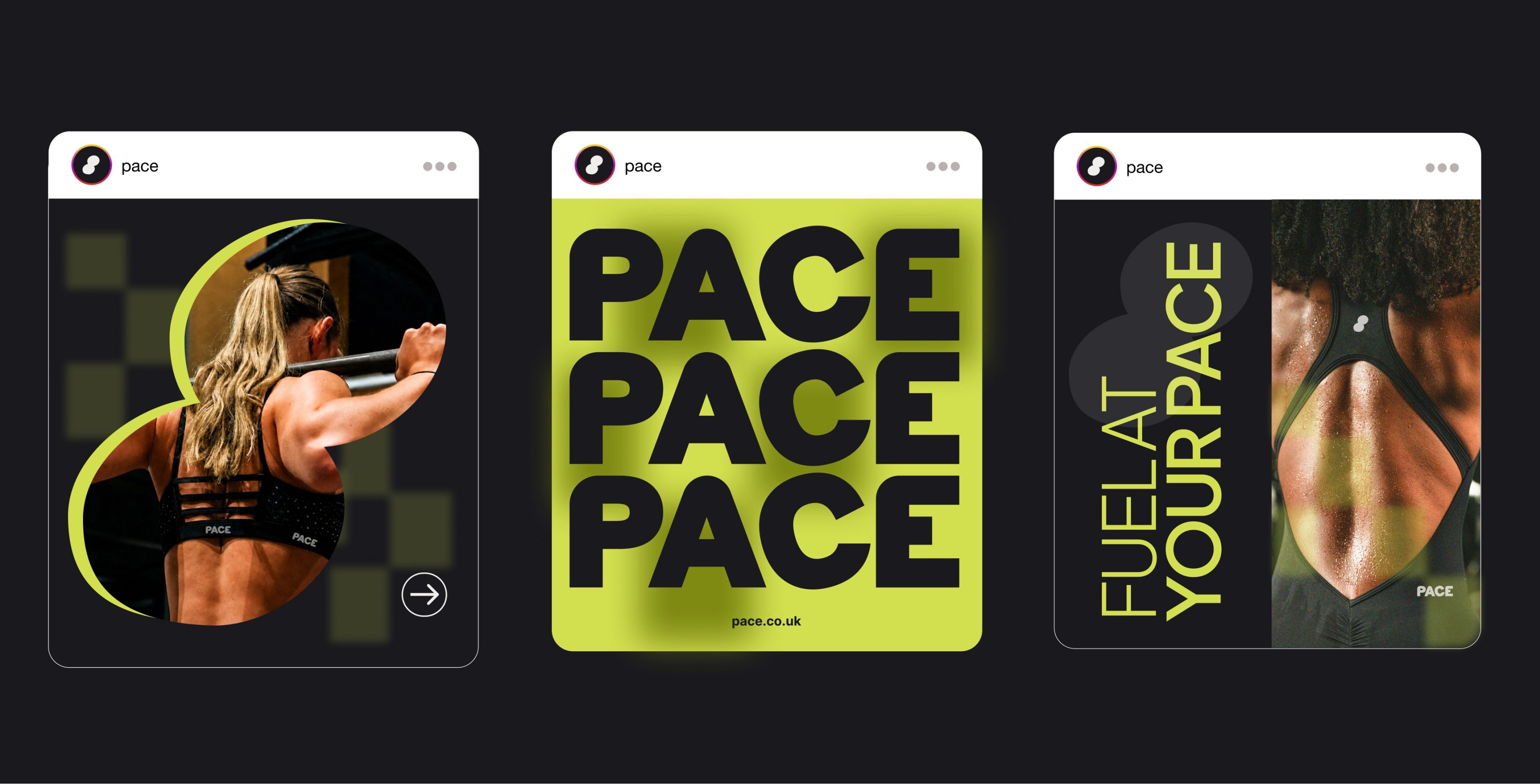
We created PACE from the ground up, developing the name, logo, brand marker, colour palette, typography, tone of voice, packaging concepts, and wider visual direction.
Every touchpoint was designed to feel cohesive, premium, and performance-led without falling into the usual supplement brand stereotypes.
The packaging became the hero of the concept, supported by lifestyle applications and brand messaging that brought the world of PACE to life.
More than anything, we focused on building a brand, not just designing products. One that felt authentic, design-led, and strong enough to grow far beyond the shelf.

What happened after the project.
Although PACE started out as a brief to create a visual identity for a supplements brand, we took the brand further than that - showing how PACE could be applied across multiple lifestyle touchpoints.
What started as a creative exploration evolved into a fully realised brand world with the foundations to become a genuine challenger within the wellness space.
More importantly, it showed that performance supplements don’t have to look or sound like every other brand on the shelf.
Because the best wellness brands don’t just sell products. They build lifestyles people want to be part of.
You're in good company
Some of the fine folk
we’ve worked with


















Grab a brew. Have a read.
We say it as we see it