The brief
Create a full rebrand for a new UK Build to Rent operator.
Sector: Build to Rent
Client: Una
We gave it the right voice.


Brand Show Reel


How we made sh*t happen for Una.

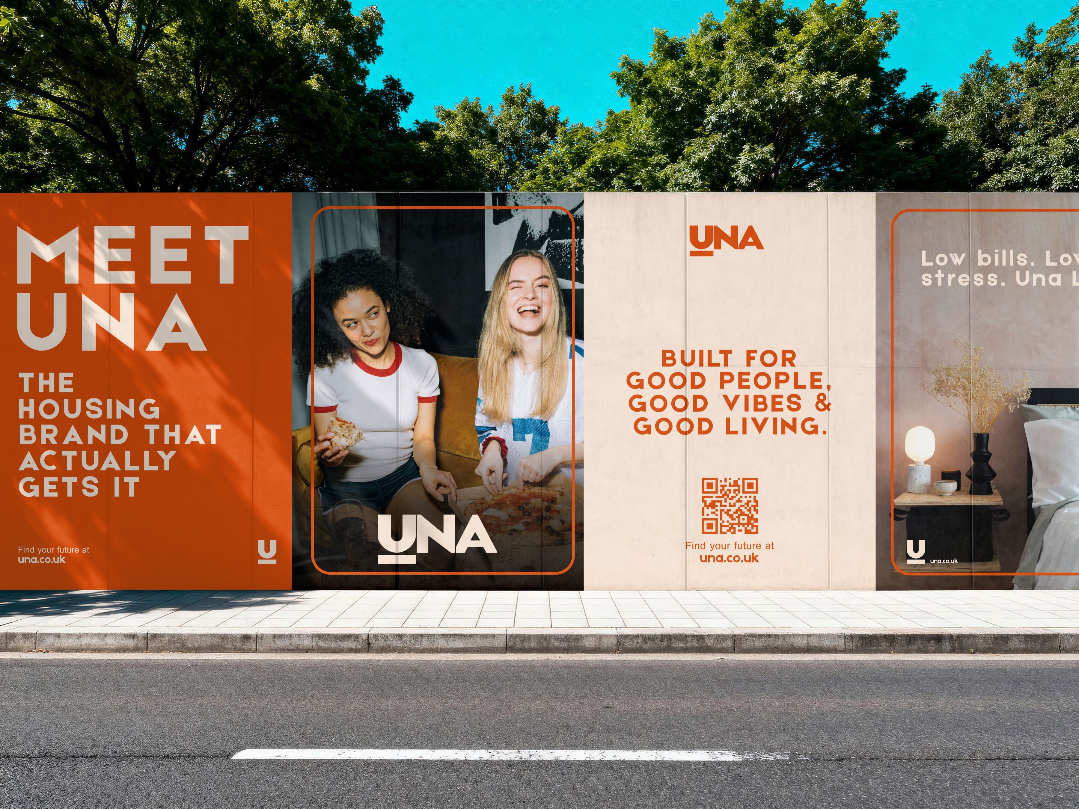
About Una.
Una is an early-stage Build to Rent operator in the UK market, catering for a wide and varied audience. From students and young professionals through to lifestyle renters and those renting later in life, Una’s offer spans multiple demographics while sitting under one operator brand.
When the Una team approached us, the brand already existed but had not yet fully launched into the market. They recognised early on that the existing visual identity wasn’t strong enough to compete in a growing and competitive operator space. The brand needed to feel more confident, more considered and more visually engaging, while properly representing both the business vision and the people it was being built for.

What Una wanted to achieve.
Una’s core challenge was balance. They needed a single, recognisable brand identity that felt cohesive at a high level, but flexible enough to resonate with very different audience groups.
Their goal was to create a brand look and feel that was instantly identifiable as Una, yet adaptable across different Build to Rent products and markets. One brand, multiple audiences, without losing clarity or consistency.
They were looking for something multi-dimensional, not a one-size-fits-all solution and having seen our work with Found, an operator working across both residential and commercial spaces, the Una team knew we were the right fit.

Getting the project off the ground.
We began the project with a strong foundation. Una already had a name, but what was needed was a clearer sense of how that name should show up visually.
Early conversations focused on understanding Una’s different audiences and how each one interacted with the brand. It quickly became clear that a varied colour palette would be key. The brand needed one core identity, supported by a wider palette that could be dialled up or down depending on the market and message.
To shape this, we looked beyond the Build to Rent sector, taking inspiration from lifestyle and hospitality brands that manage to appeal to a broad audience without losing their identity. This research helped us define how Una could feel premium, approachable and adaptable, without becoming fragmented.

What we delivered.
We created a visual brand identity that brought Una to life and gave them a strong, confident footing in the Build to Rent market.
From the logo and core visuals through to the wider colour palette and supporting brand elements, everything was designed to work as one system. Flexible, but consistent.
In a sector where a lot of brands blur into one, Una now stands out. The identity works across every touchpoint, engaging investors and partners while positioning the business as the credible, serious operator it is. The result is a brand that works across every touchpoint, engaging investors, partners and residents alike, and giving Una a strong, distinctive presence as they enter the market.

What happened after the project.
Following the initial rebrand, we were asked to support Una further by reviewing and reworking a number of key brand assets.
One of the main challenges the Una team faced was how to actually apply a wide colour palette across real-world assets without it becoming messy or inconsistent. The website was a perfect example. It had been built using the old brand and wasn’t applying the colour palette in the right way.
So we stepped back in and created a range of application examples to show the brand in action. One of those was a refreshed website skin, clearly demonstrating how the colours, typography and visuals should be used together.
These assets gave the in-house team a clear framework to work from, helping them apply the brand properly and build on it as Una grows.
You're in good company
Some of the fine folk
we’ve worked with


Grab a brew. Have a read.
We say it as we see it