The brief
Create a visual brand for a new single-family home management platform
Sector: Single-family homes
Client: Renoa Living


Branding Show Reel


How we made sh*t happen for Renoa.

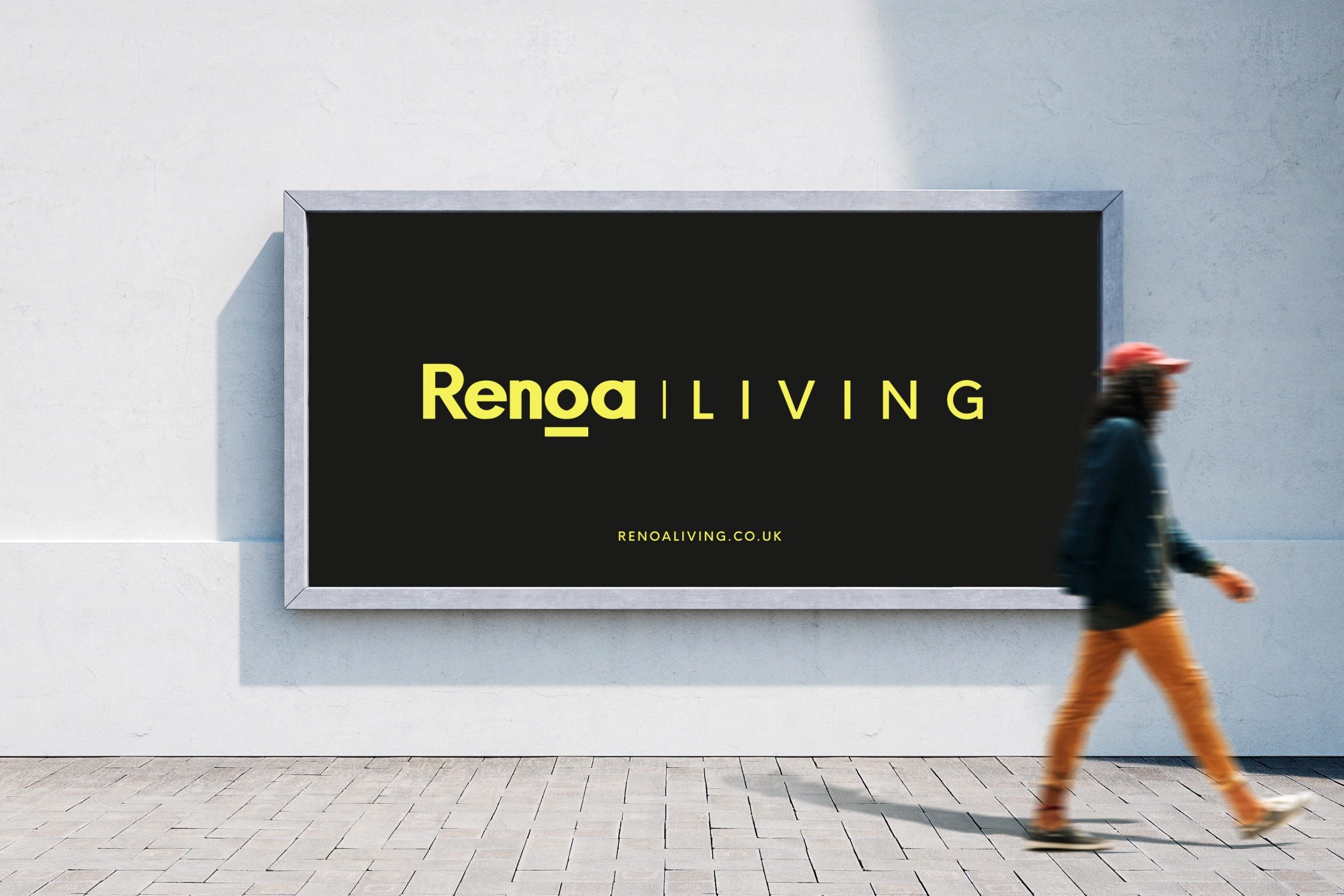
About Renoa.
Renoa is the UK’s first tech-driven platform for the single-family home market. Their smart, vertically integrated tech stack makes operations smoother and helps drive better returns for the funds and institutional investors they work with.
They’re a new player in the property world, which is perfect; that’s our bread and butter and exactly the kind of business we love getting stuck into.

What Renoa wanted to achieve.
Renoa came to us with just a proposition, no name, no branding or visual identity.
They wanted a professional brand that could hold its own in a competitive B2B market. It needed to be engaging, relatable, and recognisable, while still looking sharp and credible.
In a sector where mega brands are hard to find, and let’s be honest, it’s not the most glamorous space, they wanted something that would make them stand out from day one.

Getting the project off the ground.
For this project, we didn’t need to start completely from scratch, Renoa already had their proposition and business values sorted. Our job was to take all of that and turn it into a brand that looked as strong as it sounded.
Because this was a sub-brand of a bigger nationwide business, it had to sit comfortably within their parameters while still standing on its own two feet.
We also looked at the wider market, competitors, and what works and what doesn’t in the sector to make sure Renoa’s visuals would be engaging, professional, and instantly recognisable. From there, we started building a brand identity that made them stand out from the start.

What we delivered.
We created a visual brand identity that brought the business to life. From the name and logo to the core brand visuals, everything worked together to reflect Renoa’s position in the market and business values.
Renoa stands out in an industry where brands often blend into one and works across every touchpoint - engaging investors and partners while presenting the business as the serious, credible player they are.

What happened after the project.
Like a lot of our branding projects, after we presented the brand, we were brought back in to create several supporting brand assets needed to get Renoa out into the world quickly.
One of those was a light-holding website, where we designed the full look and feel using the new brand visuals, giving them everything they needed to launch within a tight timeframe.
From there, we worked closely with their in-house team, walking everyone through the brand and how to use it properly, so there was a shared understanding of how Renoa should look, sound, and feel across everything they put out.
You're in good company
Some of the fine folk
we’ve worked with


Grab a brew. Have a read.
We say it as we see it